Holey Bakery Website Redesign
UX/UI, Branding
Project Overview
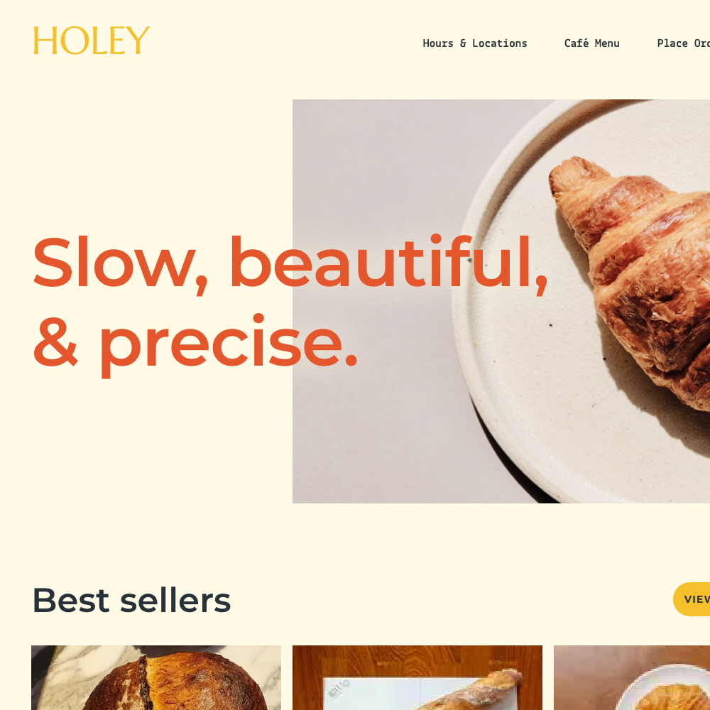
Holey Bakery is a high-end bakery and café with three locations in Bangkok, Thailand. A typical customer is 30-45 years old, and most are professionals. Holey Bakery’s website hopes to offer a fast, easy way to order food, in an environment that feels as premium and cozy as the physical stores.
The Problem
Several bakery and café websites do not reflect the identity of the physical spaces, and rely on third party delivery services that take a large percentage of each order.
The Goal
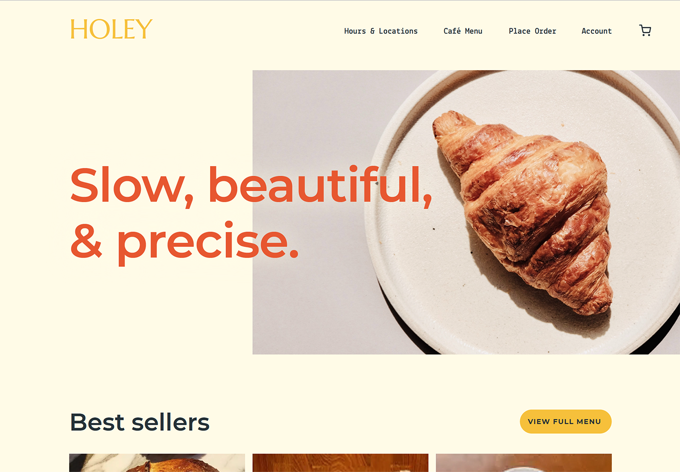
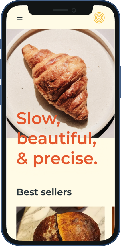
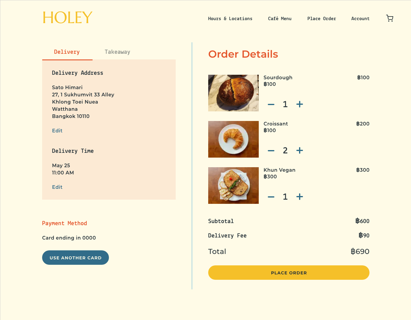
Design a website for Holey Bakery that captures the feeling of the physical locations. Create an interactive menu and ordering system that can be used for delivery and pickup.
Duration
August 2021
My Role
- UX designer leading the design process from conception to delivery
Responsibilities
- User research
- Creating low- and high-fidelity wireframes
- Creating low- and high-fidelity prototypes
- Accounting for accessibility
- Iterating on designs
User Journey Map
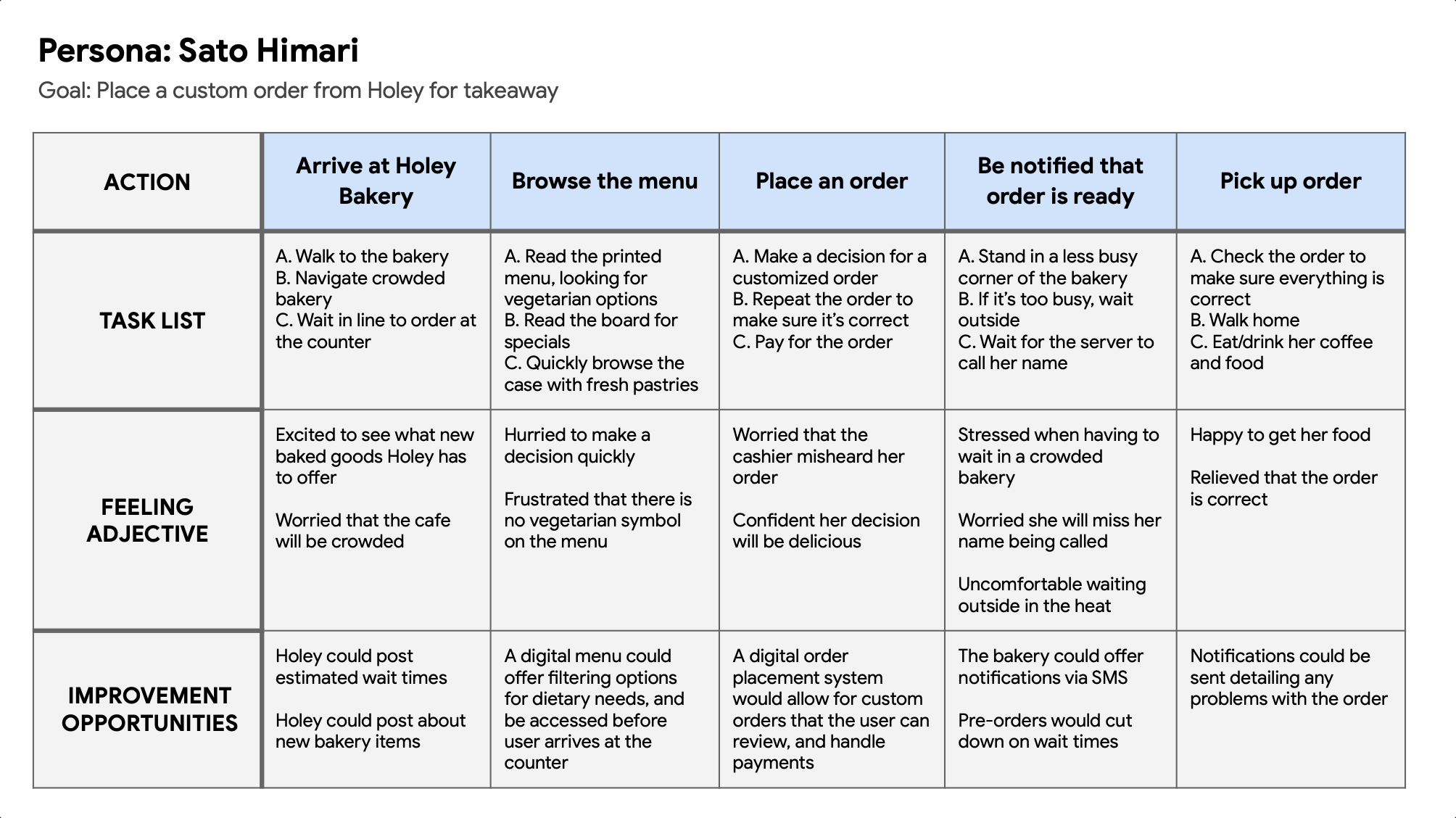
I created a user journey map to help better understand pain points a user might encounter while trying to order from Holey Bakery.
Sitemap
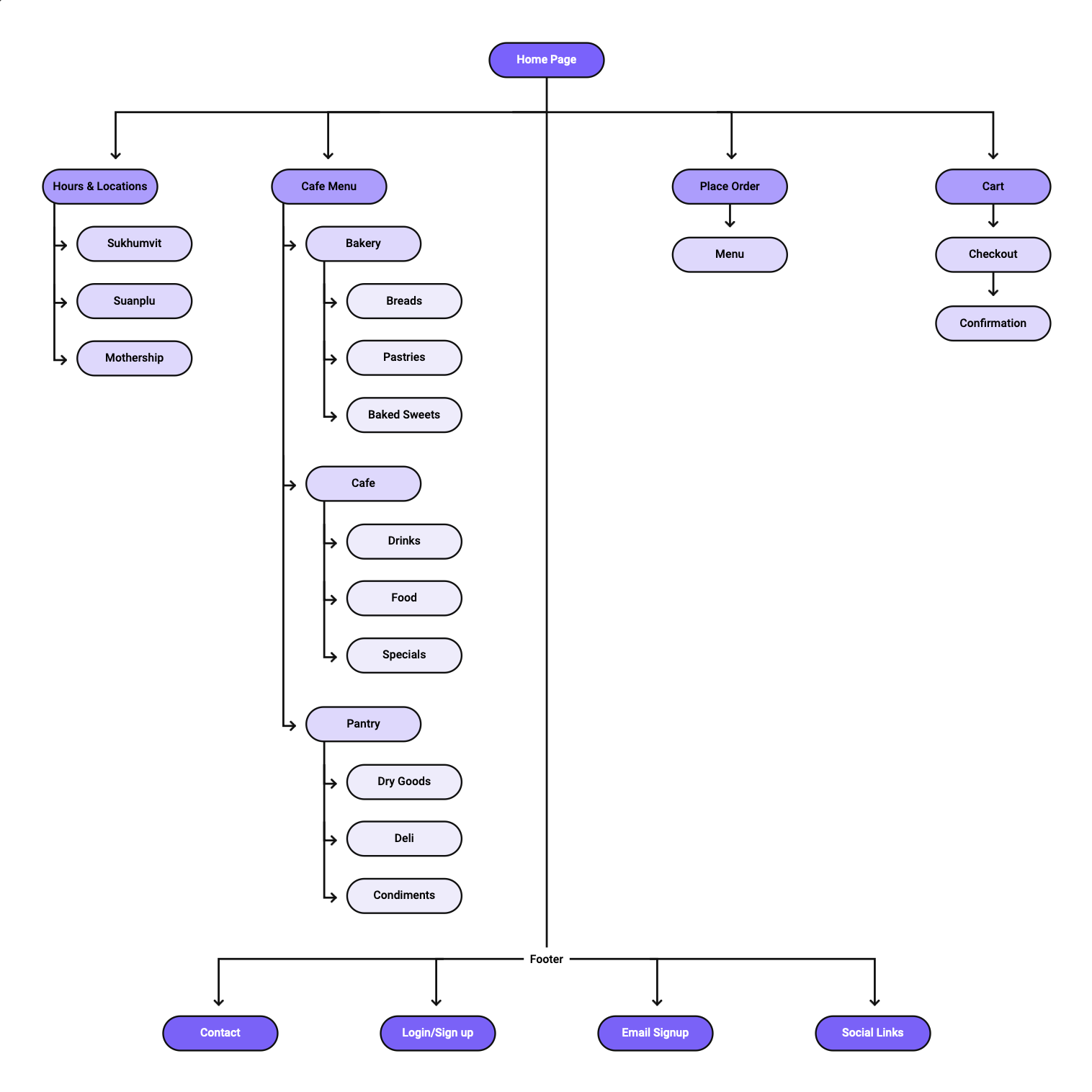
The goal of the sitemap was to map out a website that was easy to navigate, but met a variety of user’s needs.
Paper Wireframes
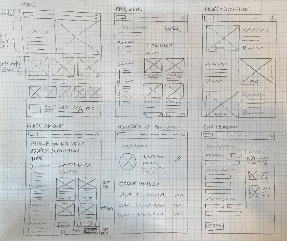
For the initial paper wireframes, I wanted to design a homepage that was an introduction to the bakery and a starting point for placing orders. The paper wireframes allowed for quick ideation and let me explore a range of layouts.
Digital Wireframes & Low-fidelity Prototypes
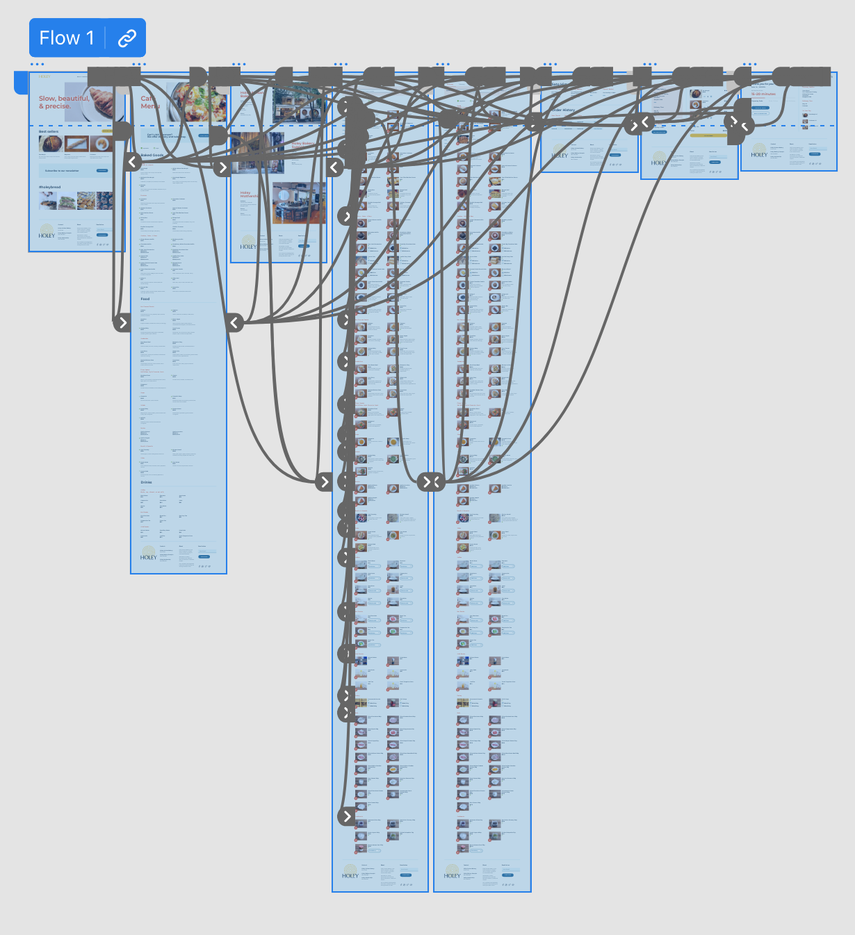
I created a low fidelity prototype in Adobe XD that outlines the user flow of accessing the café menu, order screen, and checkout process. Feedback helped me realize that I needed a confirmation screen after users complete an order.
View Holey Bakery’s low fidelity prototype.

High-fidelity Prototypes
My hi-fi prototype followed the same user flow as the lo-fi prototype, with changes. One of the changes included a more compact menu item layout, to reduce the length of order page.
View the Holey Bakery High Fidelity prototype here.
Key Mockups
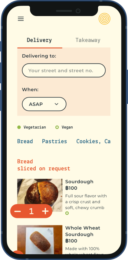
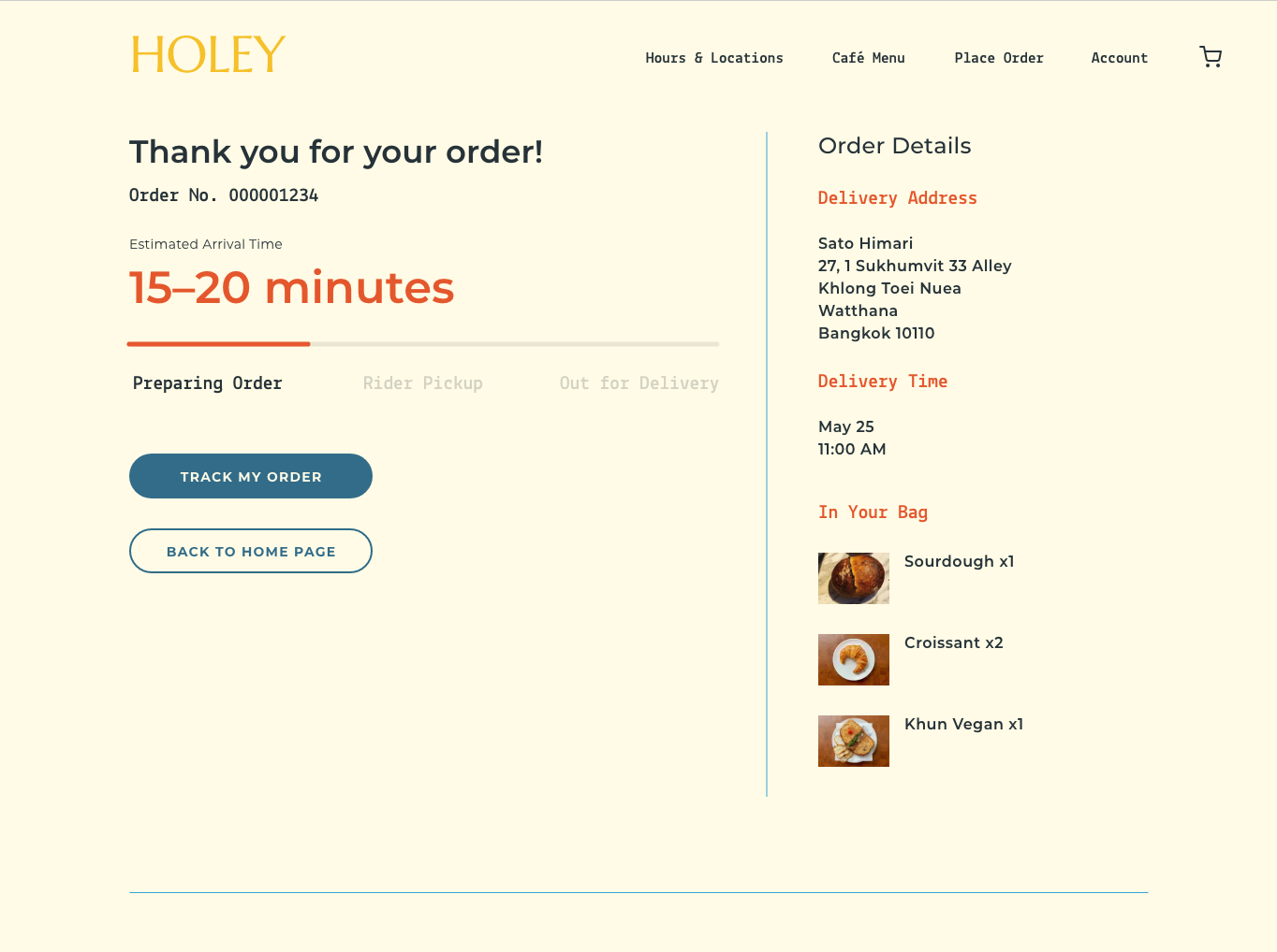
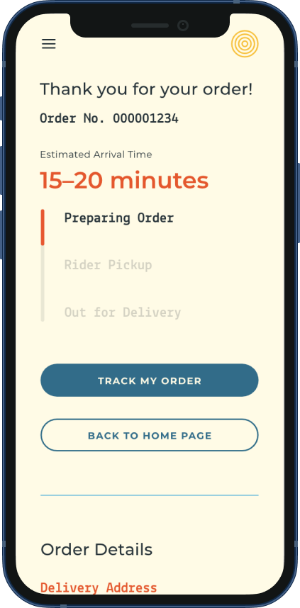
Accessibility Considerations
- Include headings with different sized text for a clear visual hierarchy
- Include landmarks to help users navigate longer pages, as well as those using assistive technologies
- Each image includes alt text to help all users make the right choice when ordering