Alexandria Transit Company (DASH) Brand Refresh
Marketing, Branding, Art Direction
Project Overview
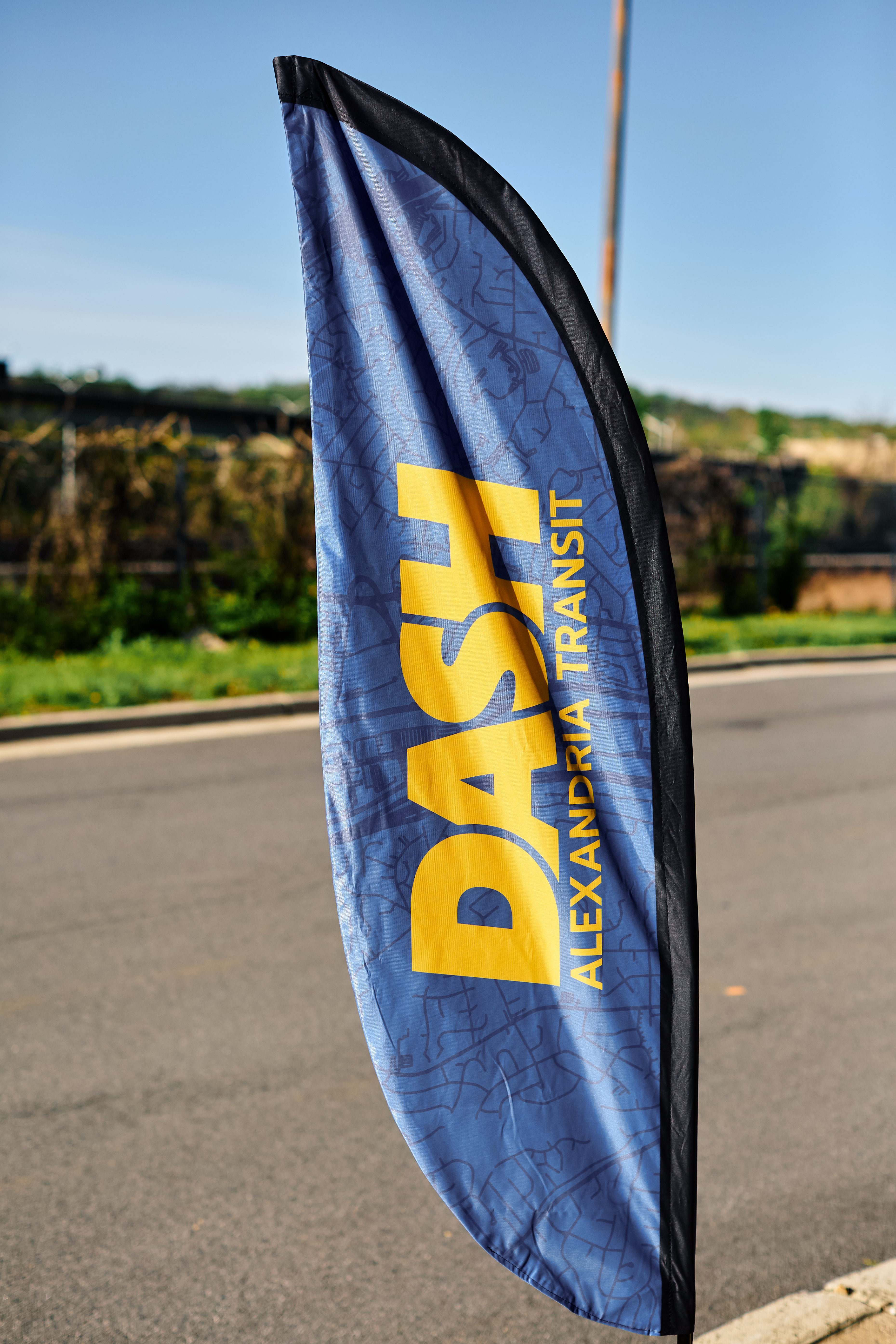
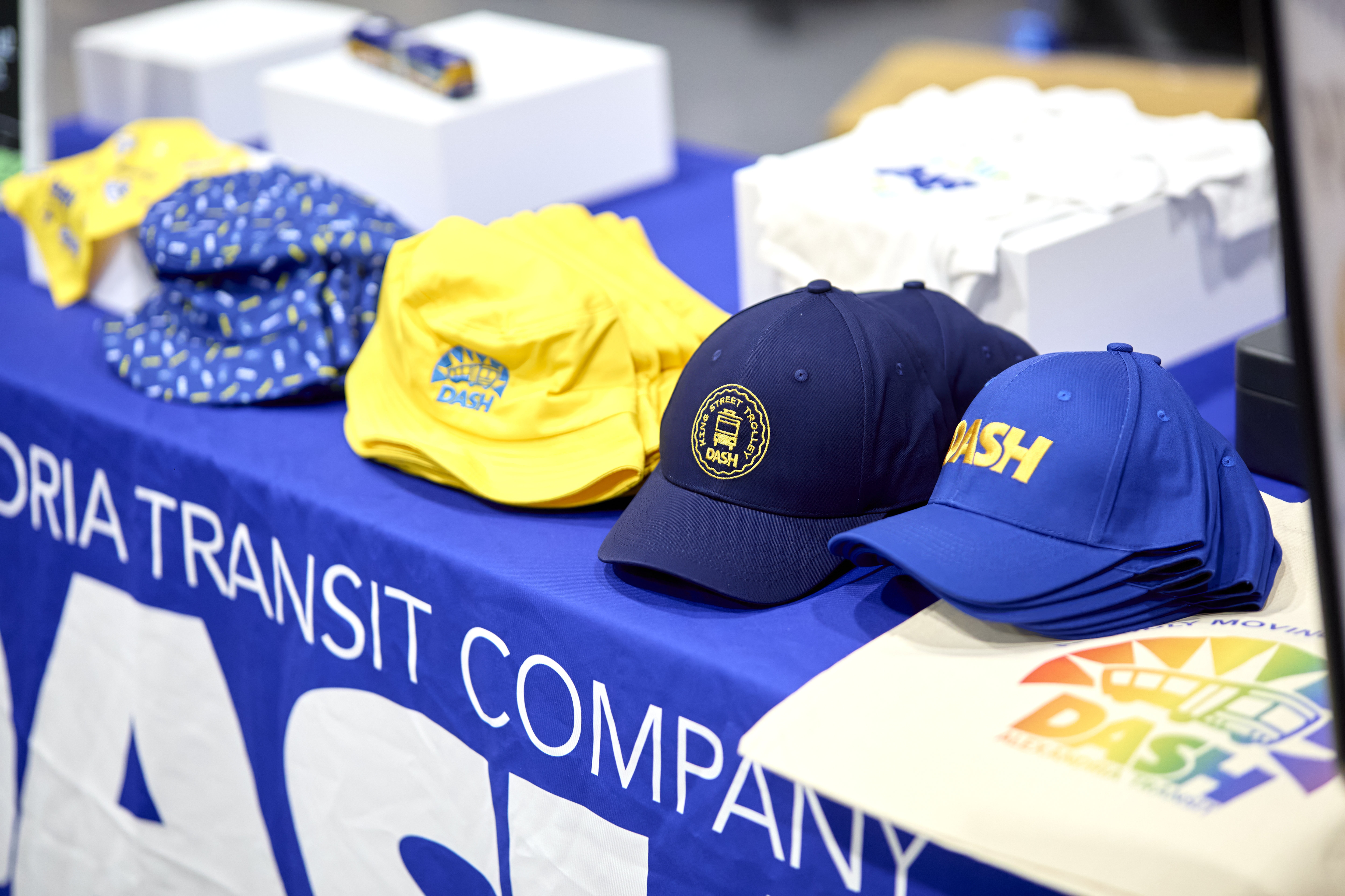
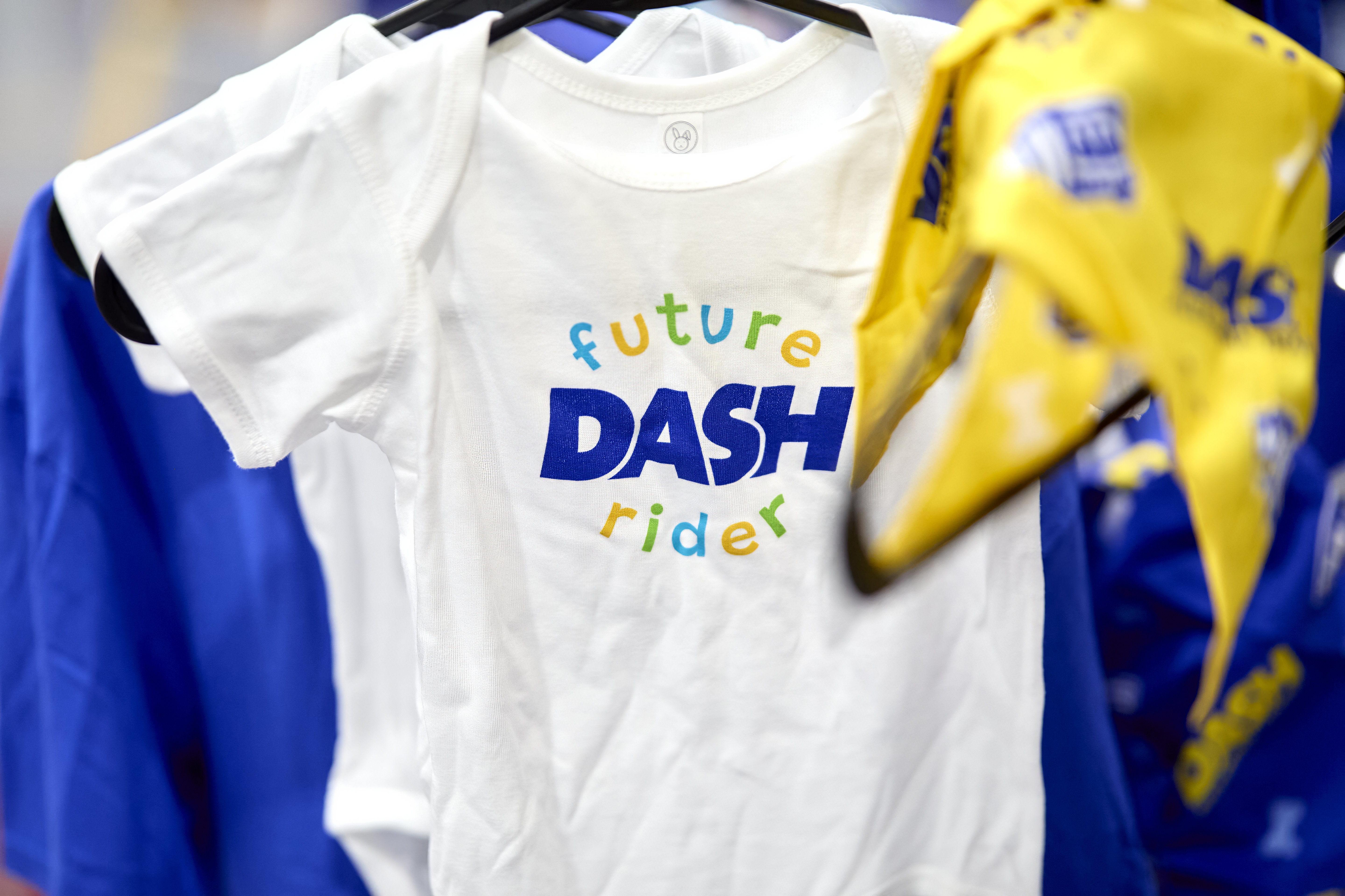
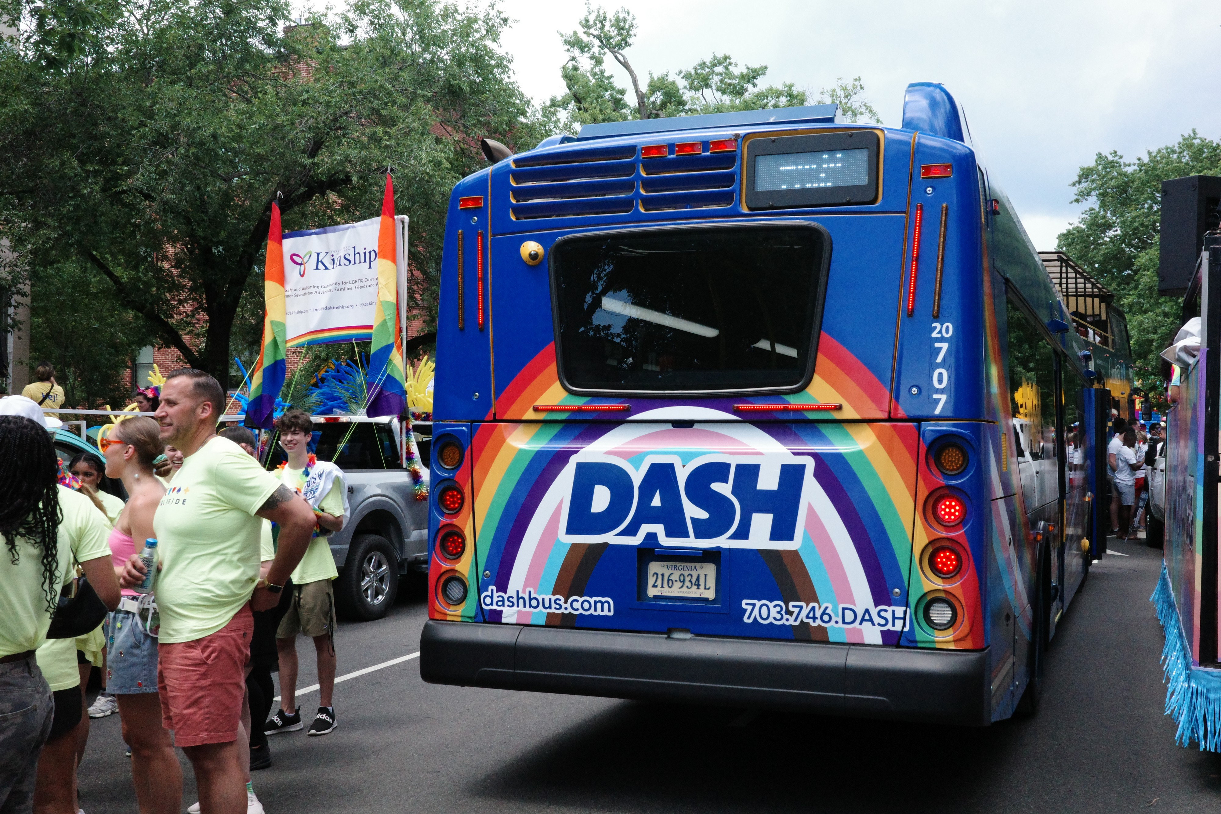
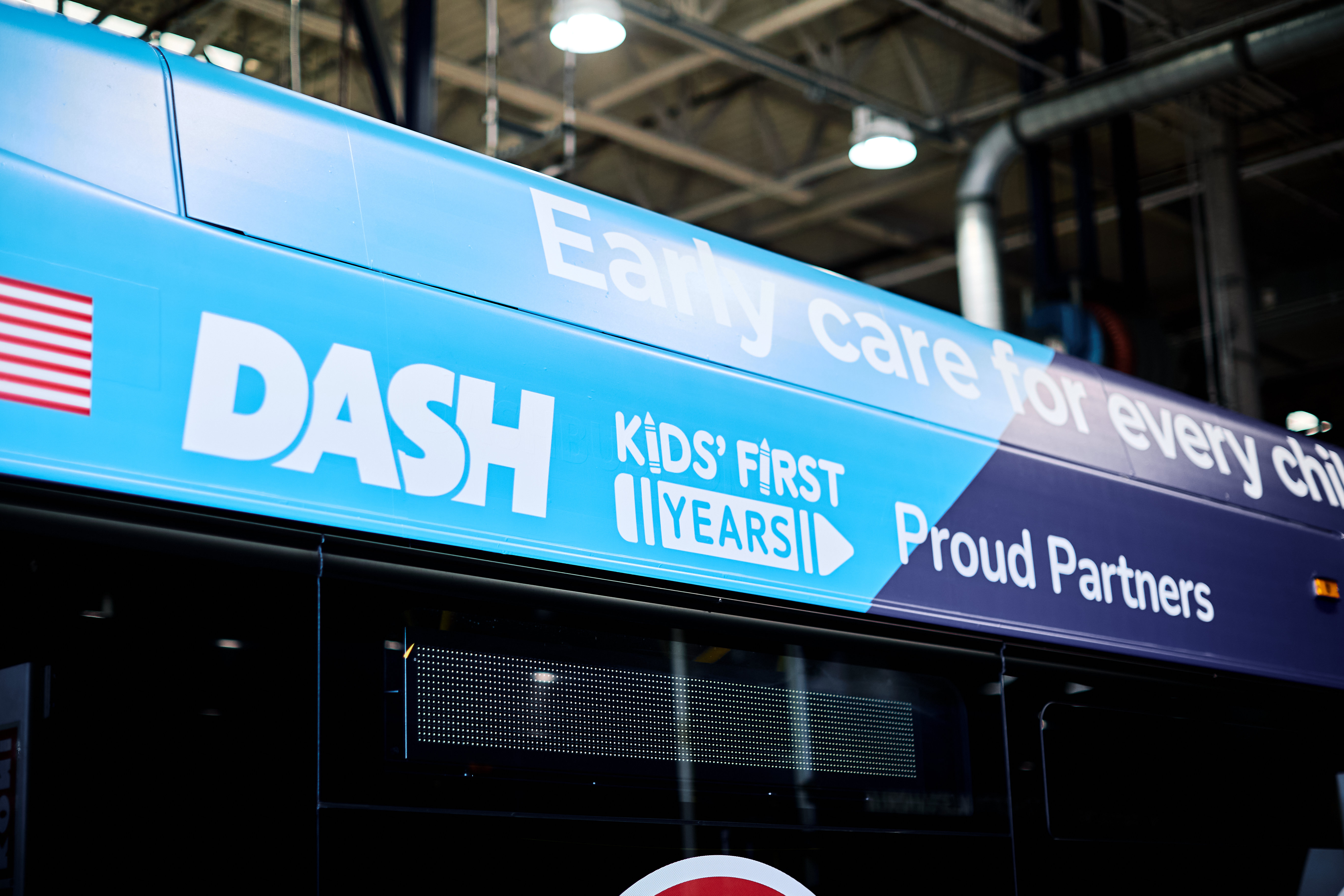
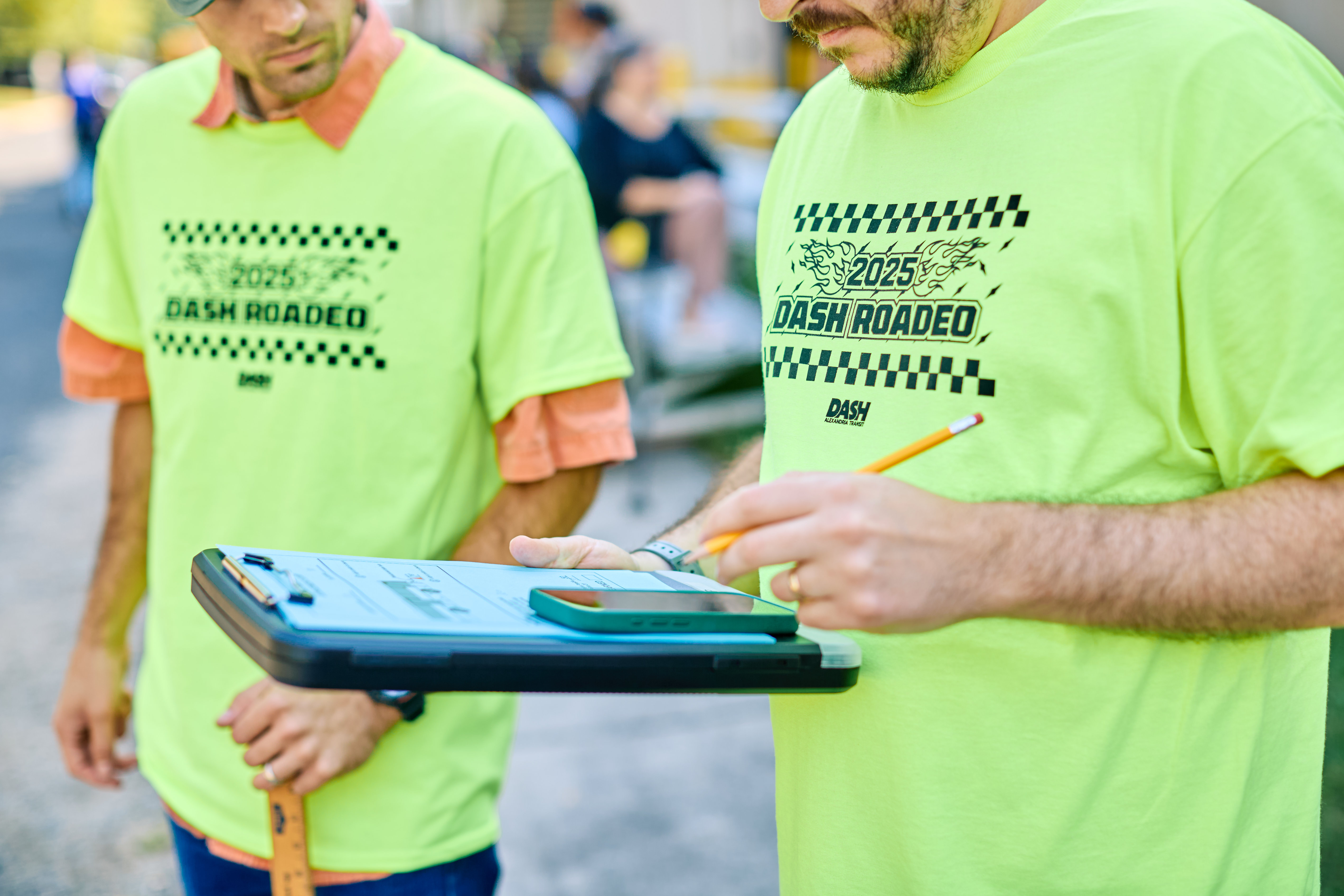
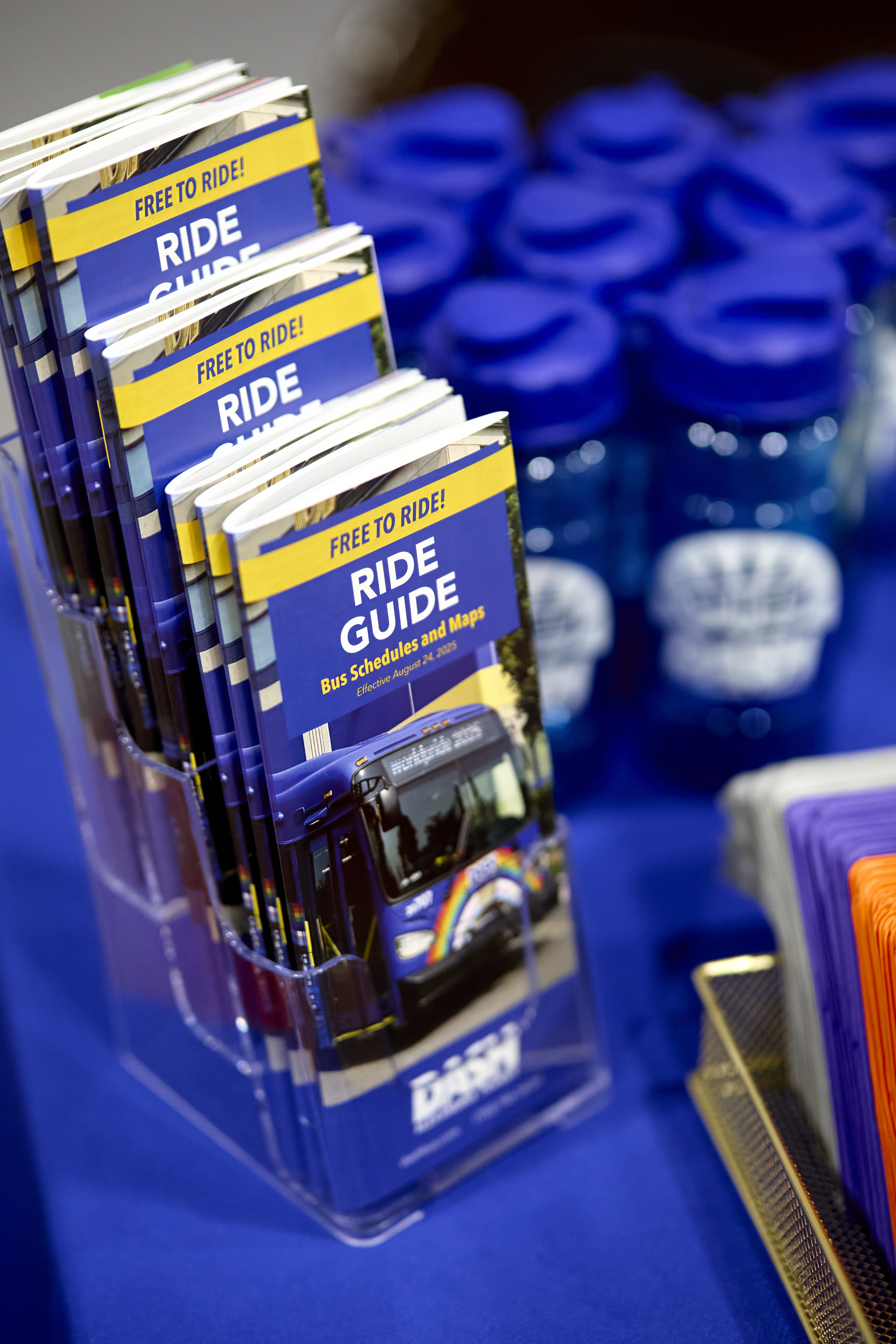
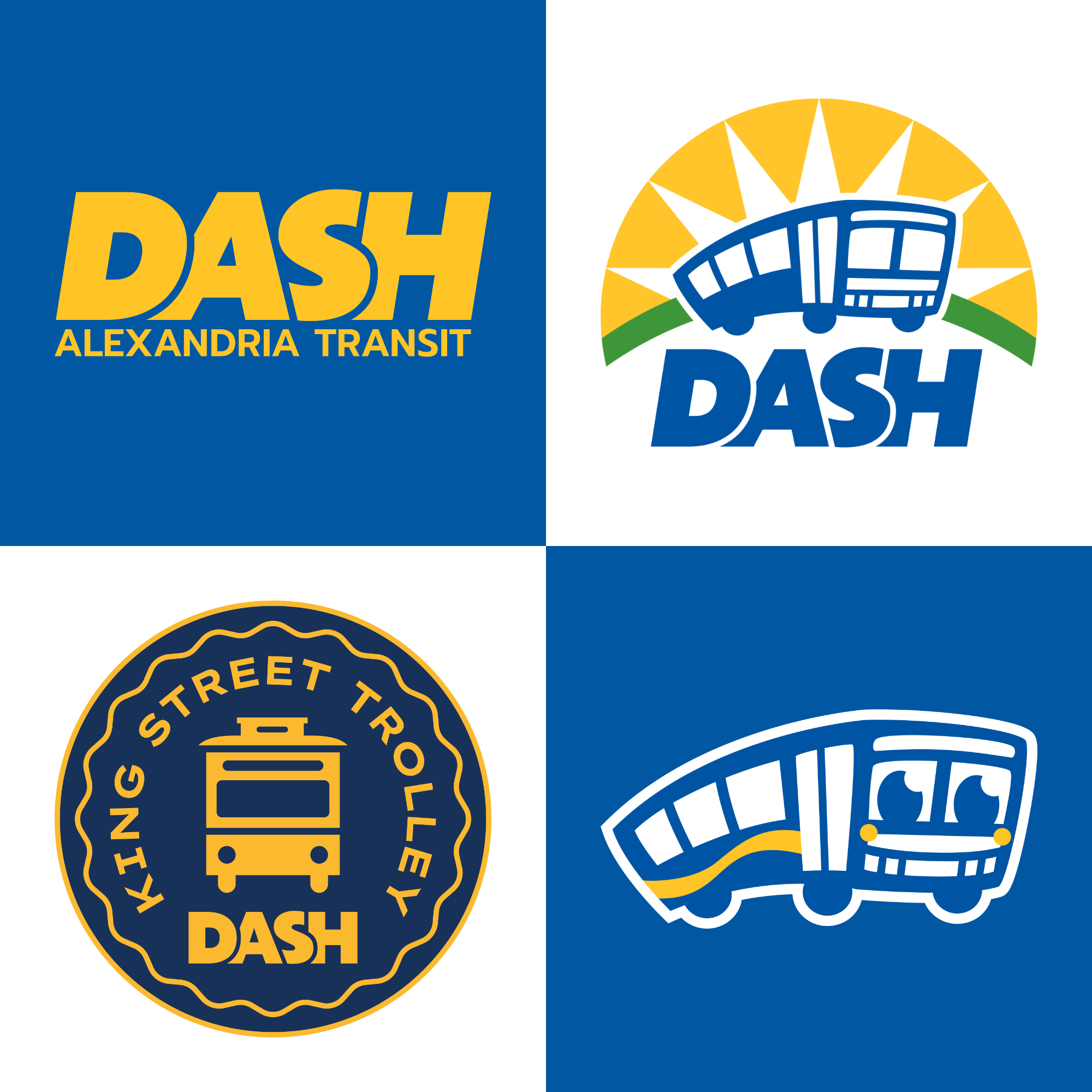
The Alexandria Transit Company (DASH) had been using the same suite of logos since its founding over 40 years ago, including one from a heritage trolley line that they took over several years ago. I delivered a new DASH Wordmark, Bus Logo, King Street Trolley Logo, and Brand Mascot.
The Goal
Modernize DASH's visual identity across three core brand assets while carrying the charm and recognition of the existing logos.
Duration
February-April 2025
My Role
- Marketing Design Lead
Responsibilities
- Research brand identity of competitors
- Design and Propose new logos
- Design Stakeholer presentations
- Iterate on designs based on Stakeholder feedback
- Update DASH's brand guidelines
- Develop a Marketing Campaign to she new logos with the community
The Wordmark
The original logo featured bold letterforms, great for spotting on a bus or a phone screen. But the combined "A" and "S" felt unintentional, and the “Alexandria Transit Company” text made the logo feel off-balance. In the updated version, I angled the letters into italics, overlapped them slightly, and cleaned up the overall structure to make it more readable and dynamic.
Original Logo
New Logo
The Bus Logo
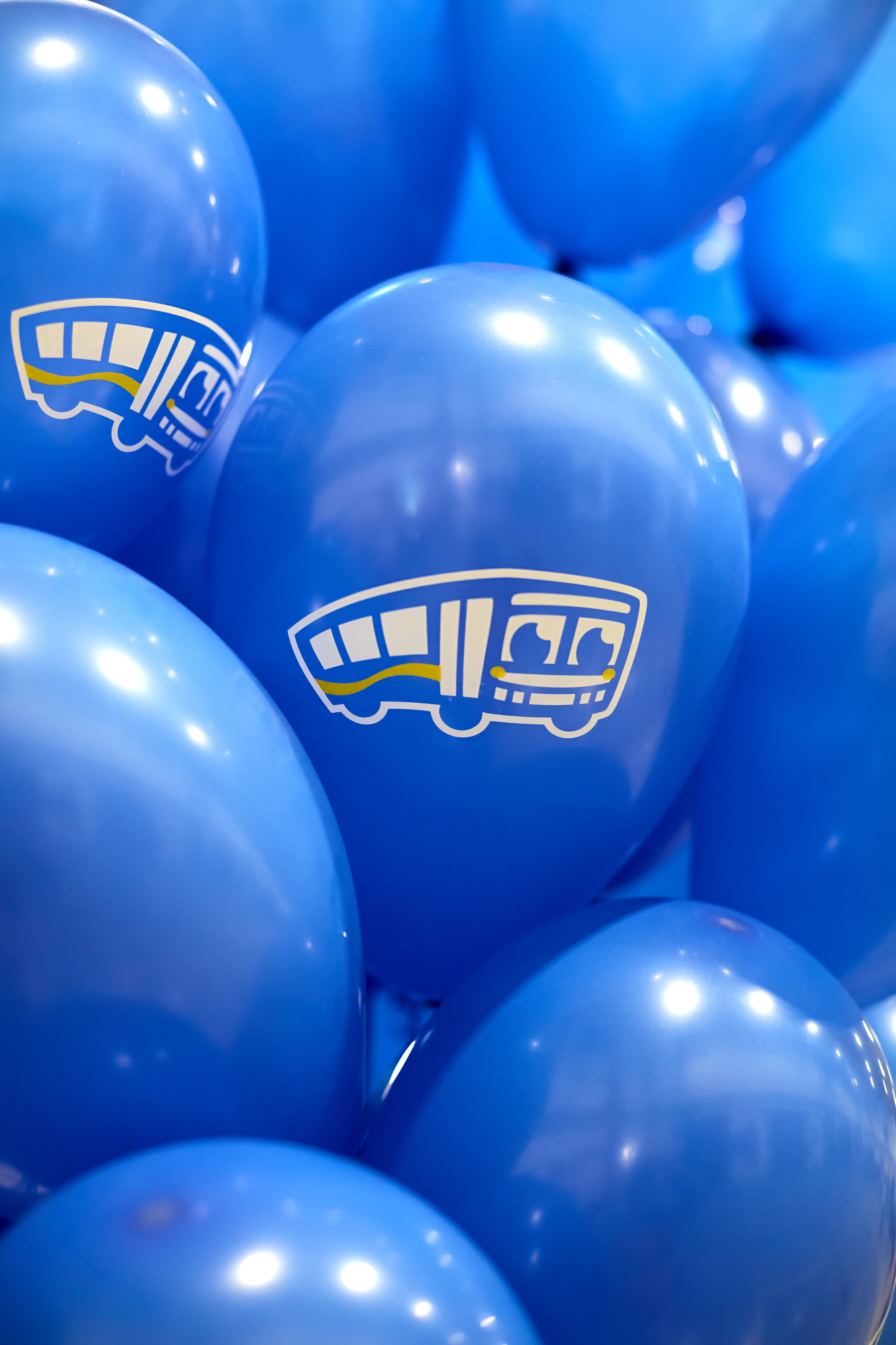
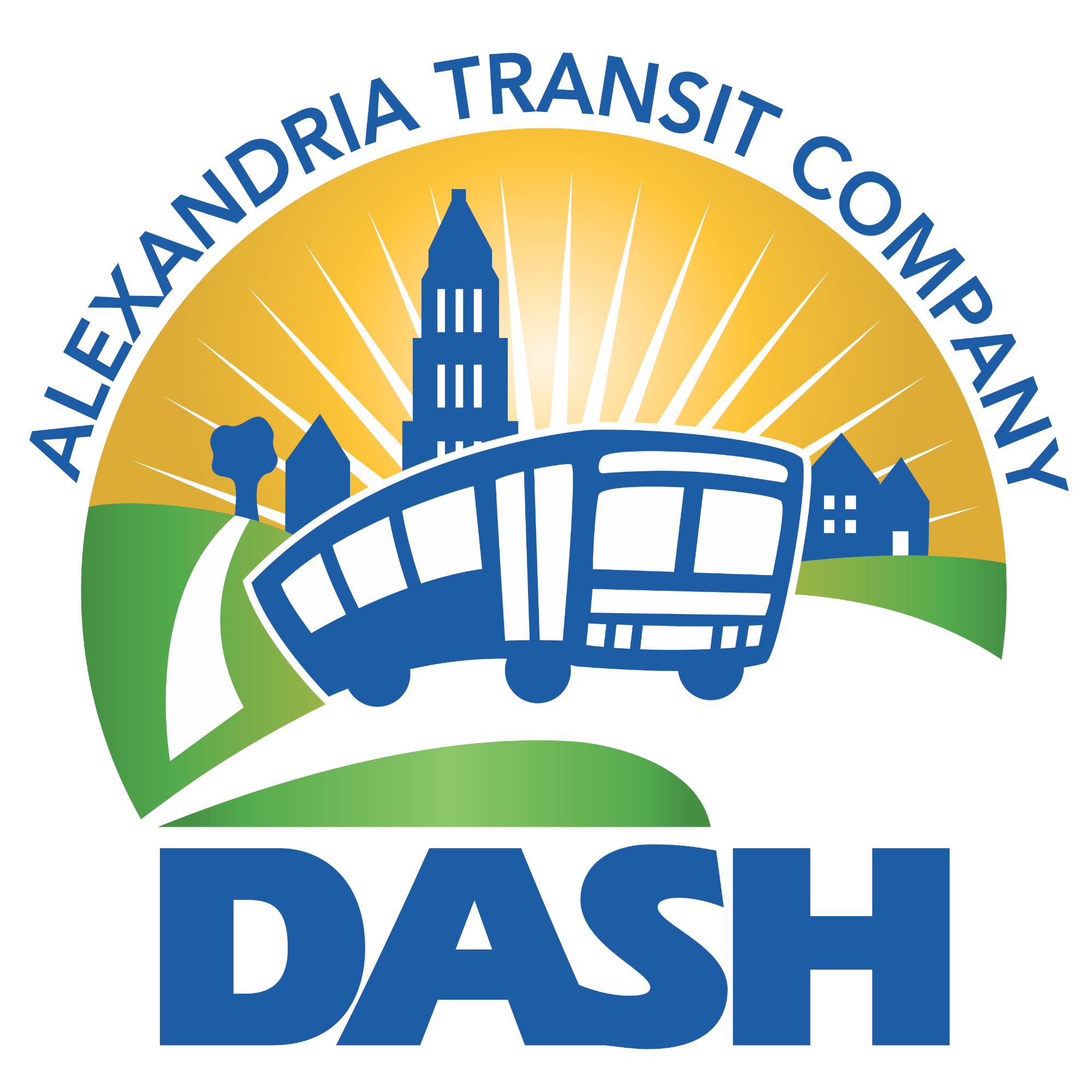
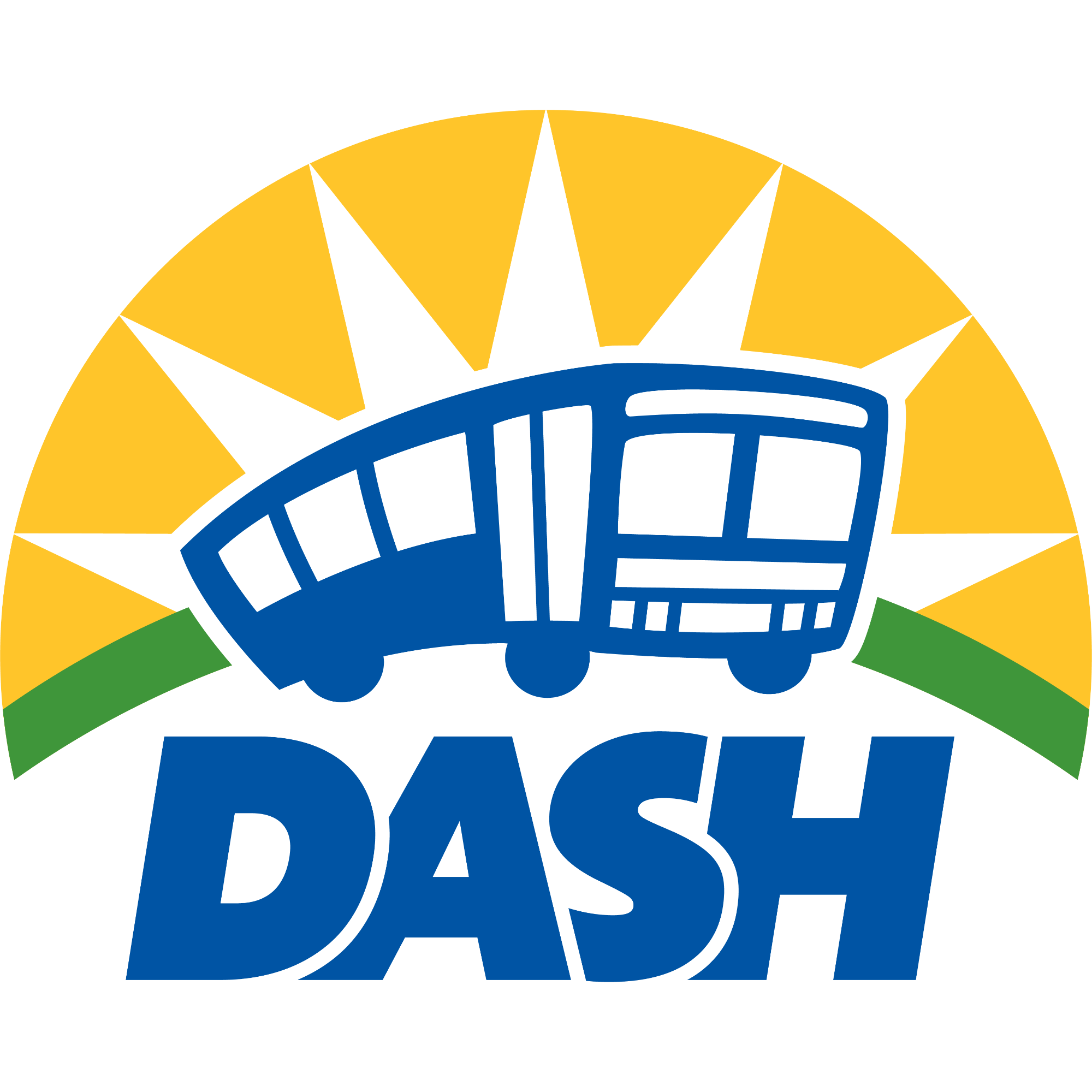
The redesign focused on streamlining the background environment while keeping the bus illustration the same.I simplifed the sunburst pattern, curved the road to create a circular shape, and removed the distracting landscape elements. The updated wordmark sits neatly underneath, creating a balanced, friendly logo that is easier to recognize.
Original Logo
New Logo
The Trolley Logo
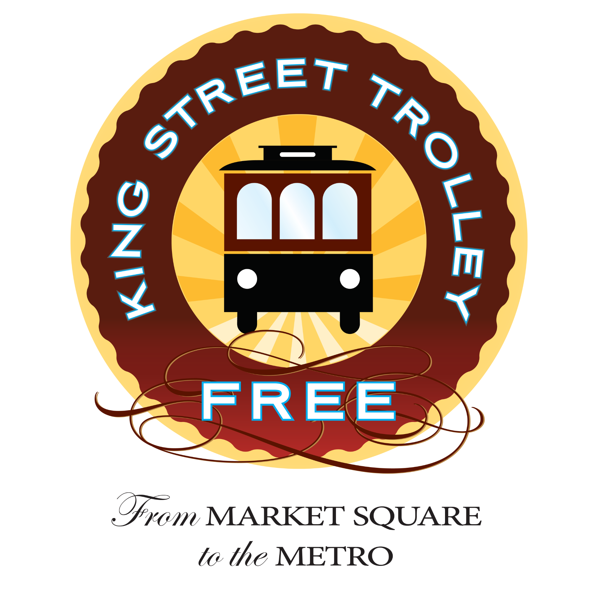
The operation of the King Street Trolley was taken over by DASH several years ago, which meant that the logo lacked visual parity with the rest of the DASH brand identity. Alexandrians and visitors alike often don’t realize DASH operates the trolley, so I wanted to make that link clearer.
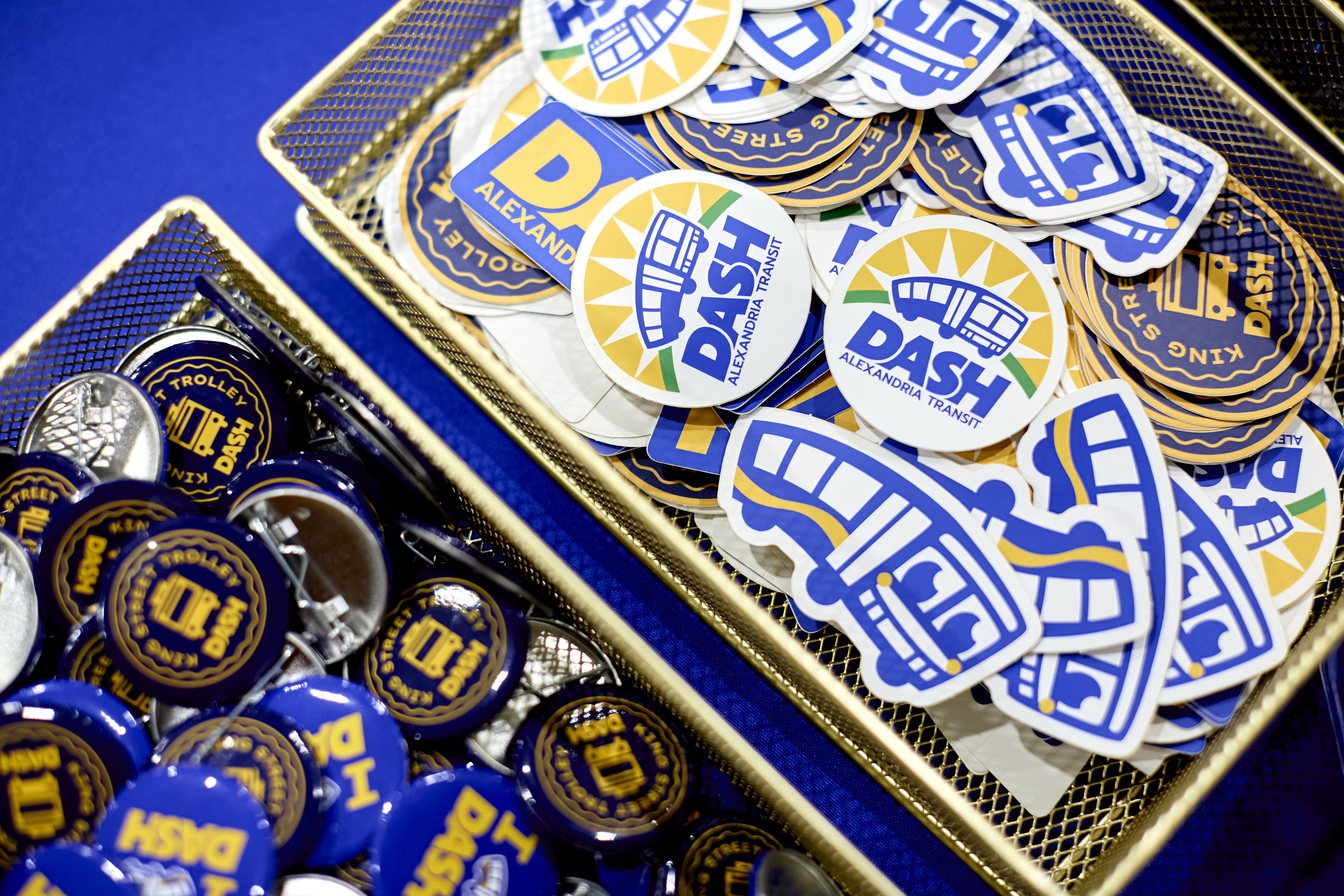
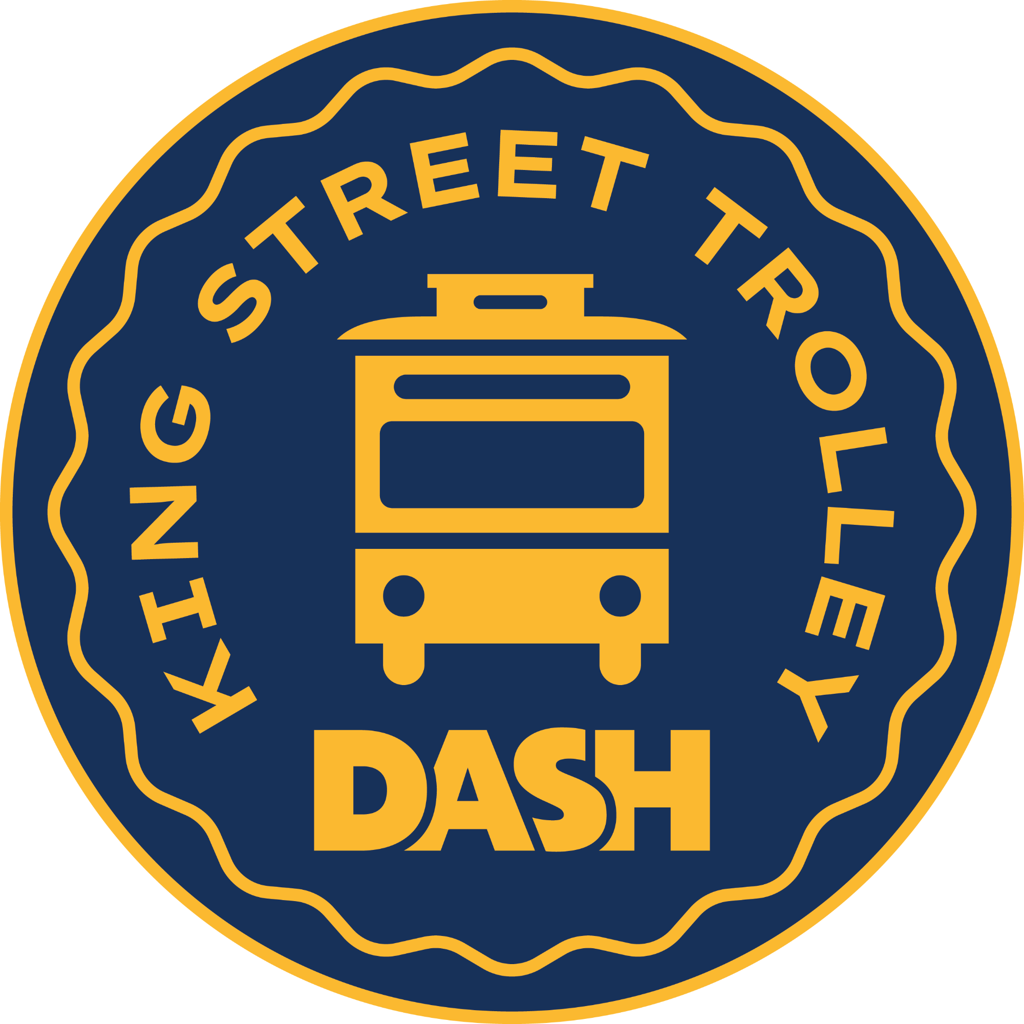
The new design draws inspiration from vintage transit tokens, classic American rail logos, and Japanese train stamps. A navy and gold color palette ties back to DASH’s blue and yellow. The scalloped circle remains, now as a simple outline, and the word “free” was replaced with the DASH logo to reinforce the connection between the trolley and DASH.
Original Logo
New Logo
Dashy the Mascot
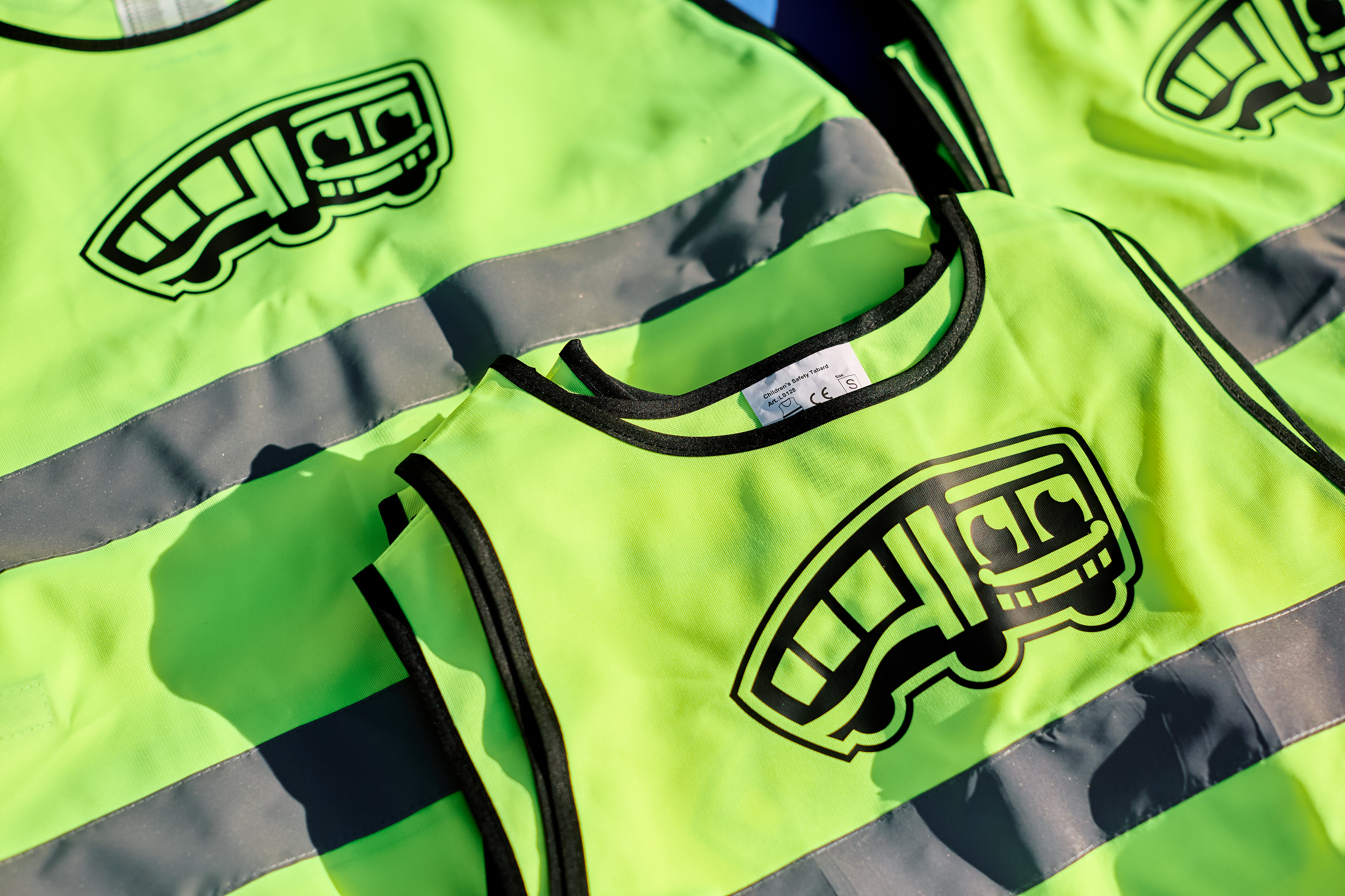
As part of the refresh, DASH introduced Dashy, a friendly new mascot. Named by the DASH staff, Dashy brings a friendly face to DASH and helps the agency connect even more with riders and community.
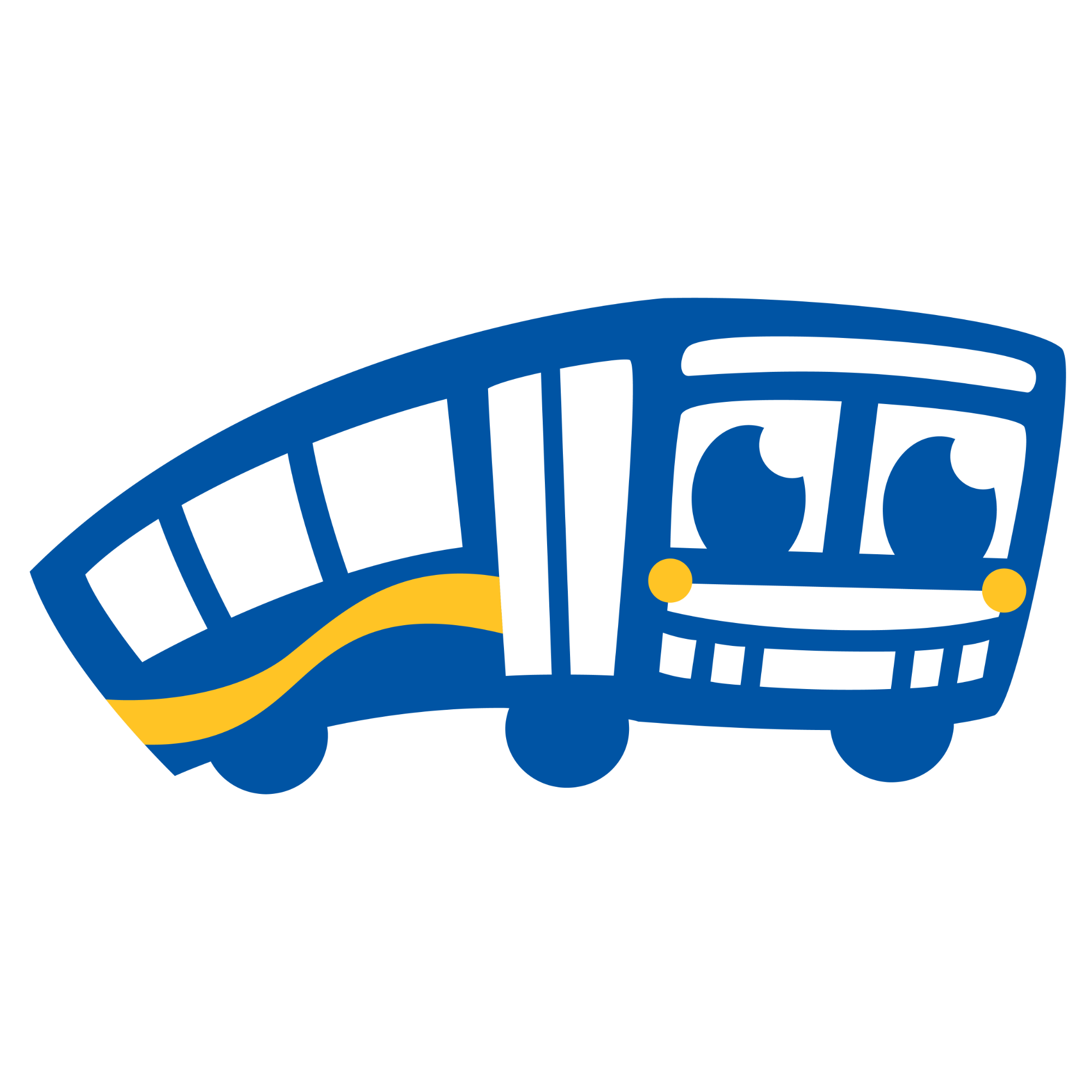
Image Gallery